Wides
- R. Avery Marshall
- Nov 25, 2019
- 2 min read

Your photos should all be wides that show 1) Deep space, 2) Flat space, and 3) Contrast of space, line, shape, tone, or color.
1) Contrast of Shape
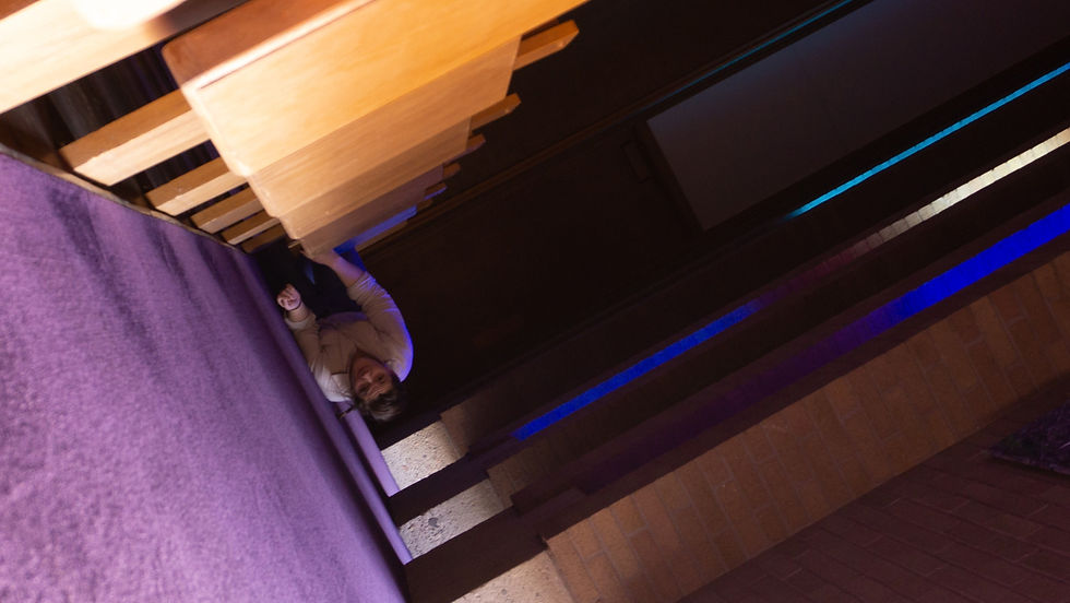
It was only after taking this photo that I realized the ambiguity of the space. Something about the way that Heather is framed along with the diagonals creates just enough spatial disorientation to confuse us, and I just love that about this wide. The contrast of space here is interesting in how it helps direct our eyes to the subject. The roundness of her shoulders and head slam against the geometric diagonals throughout the image. There is also a nice contrast of color helping out our interest in the image.
2) Flat Space

These next two could almost be in a triptych just about how longitudinal planes contribute to space. Here we have some pretty flat space. There are a few planes and a longitudinal plane on the left, but their contribution to the depth of the scene is minor. Overall we feel the flatness of the background and the almost compressing effect the 50mm lens on the space here.
3) Deep Space

Now, this image was also shot on a 50mm. But, before you kee-haul me for misleading you on it's compression, the longitudinal planes converging in the center of the image seriously deepen the image. If you cover up those pews with your hands, you'll get back into flat land rather quickly. That being said, this image works as deep space and is interesting to look at because that space works against the compressing of the lens. In the final image we get something familiar and both warm and cool. Compositionally this scenario attracted my eye, and the camera helped capture it in an artistic way.

Nice job Avery! These images all seem really purposeful and not just a "Shoot, I need to do this assignment, lemme see what works" type of thing. It seems like you understand the type of space you are trying to create. Also, they are just really pretty pics!
1) I love the ambiguity of space in this first one! I really had to decided whether this photo was taken top down, or from a tricky side view. It wasn't until after I saw the other pictures that I understood more about the geography of the location and that she was just on some carpet by the pews. I thought you might've gone to some kind of climbing place. In any case, leading lines, decreasing size, and tonal separation all help to give it a deep look, whether she's climbing up, down, or sideways.
2) That waffle pattern is really disorienting. Because it's the furthest thing back, yet so textured, it really helps to flatten out the space. In…